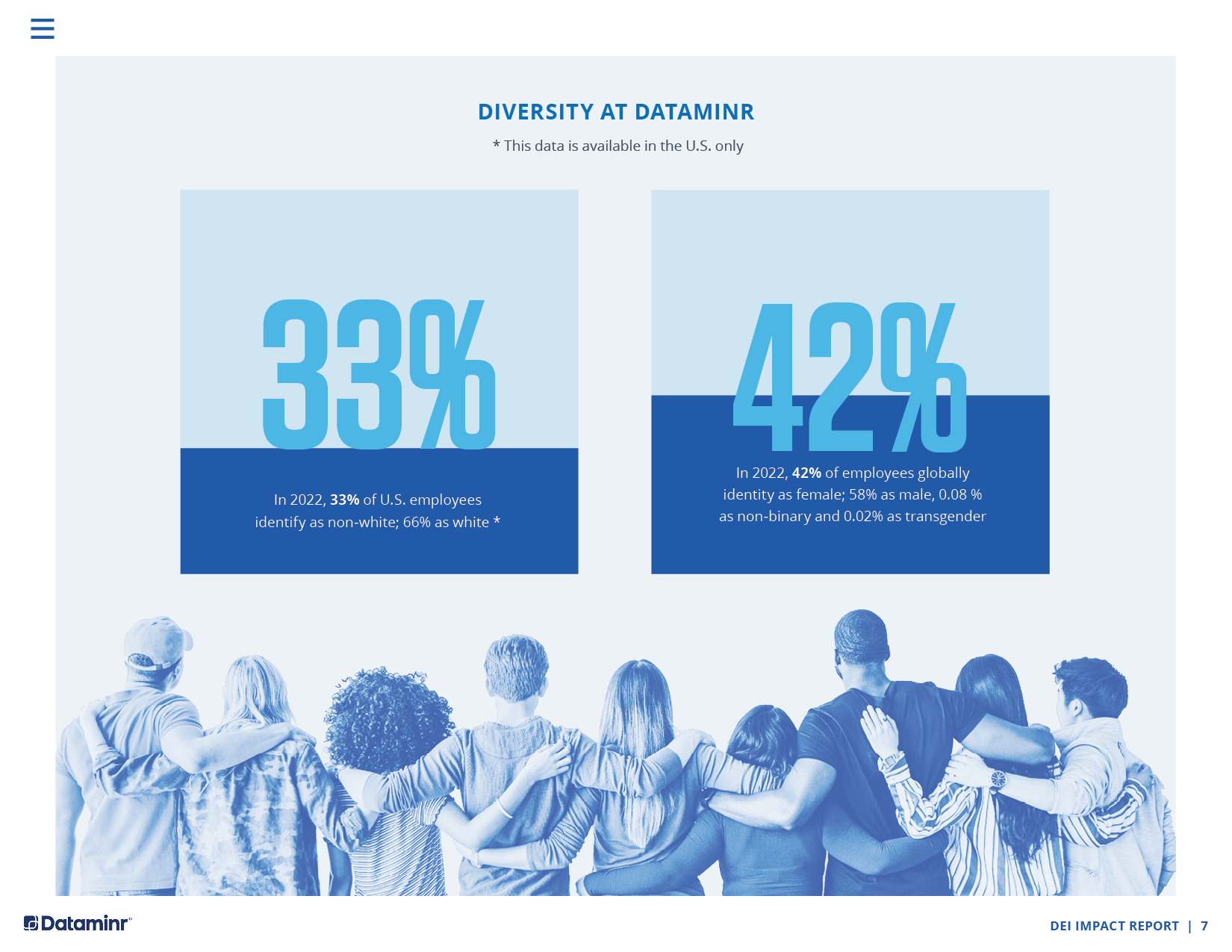
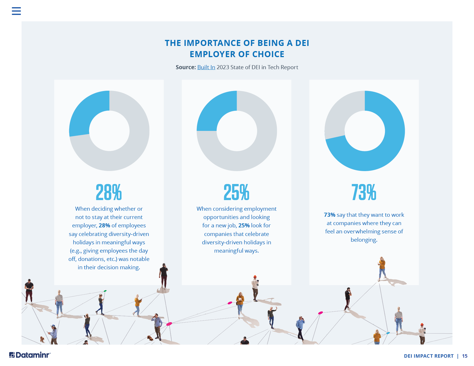
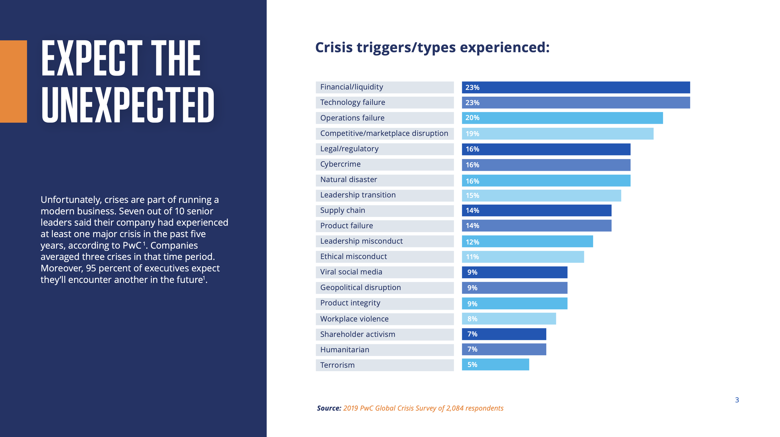
Approach to Data Visualization
My approach to data visualization focuses on clarity, storytelling, and usability. I start by identifying the key question the data needs to answer and the audience it’s intended for. From there, I organize information to highlight the most important insights first, reducing complexity and cognitive load.
I use visual hierarchy, comparison, and restraint to turn complex or dynamic data into clear, scannable narratives—helping audiences quickly understand trends, assess risk, and make informed decisions. Please see 2 case studies and some extra examples of my data visualization work below.
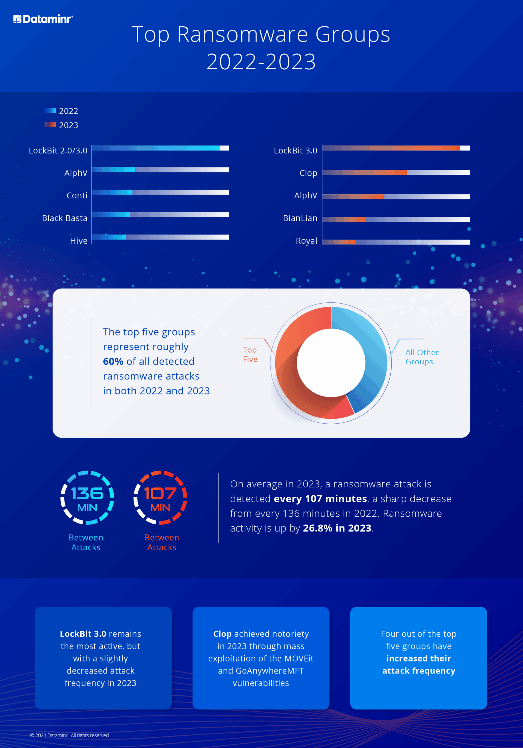
Case Study 1: Most Active Ransomware Groups (2022–2023)
Challenge
Ransomware activity increased significantly between 2022 and 2023, with attacks becoming more frequent and more concentrated among a small number of threat actors. The challenge was to present this evolving landscape in a clear, comparative way that highlights both scale and change over time.
Approach
I designed a side-by-side visualization comparing the most active ransomware groups in 2022 and 2023. The layout emphasizes concentration at the top—showing that the five most active groups account for roughly 60% of all detected attacks in both years—while also surfacing shifts in attack frequency and group behavior. Time-based metrics (minutes between attacks) were used to clearly communicate acceleration year over year.
Outcome / Key Insights
In 2023, a ransomware attack was detected every 107 minutes, down from 136 minutes in 2022, representing a 26.8% increase in activity.
LockBit 3.0 remained the most active group, despite a slight decrease in attack frequency.
Clop rose in prominence in 2023 due to mass exploitation of the MOVEit and GoAnywhere MFT vulnerabilities.
Four of the top five groups increased their attack frequency year over year.
The final visualization enables security leaders to quickly understand concentration, acceleration, and emerging risks at a glance.
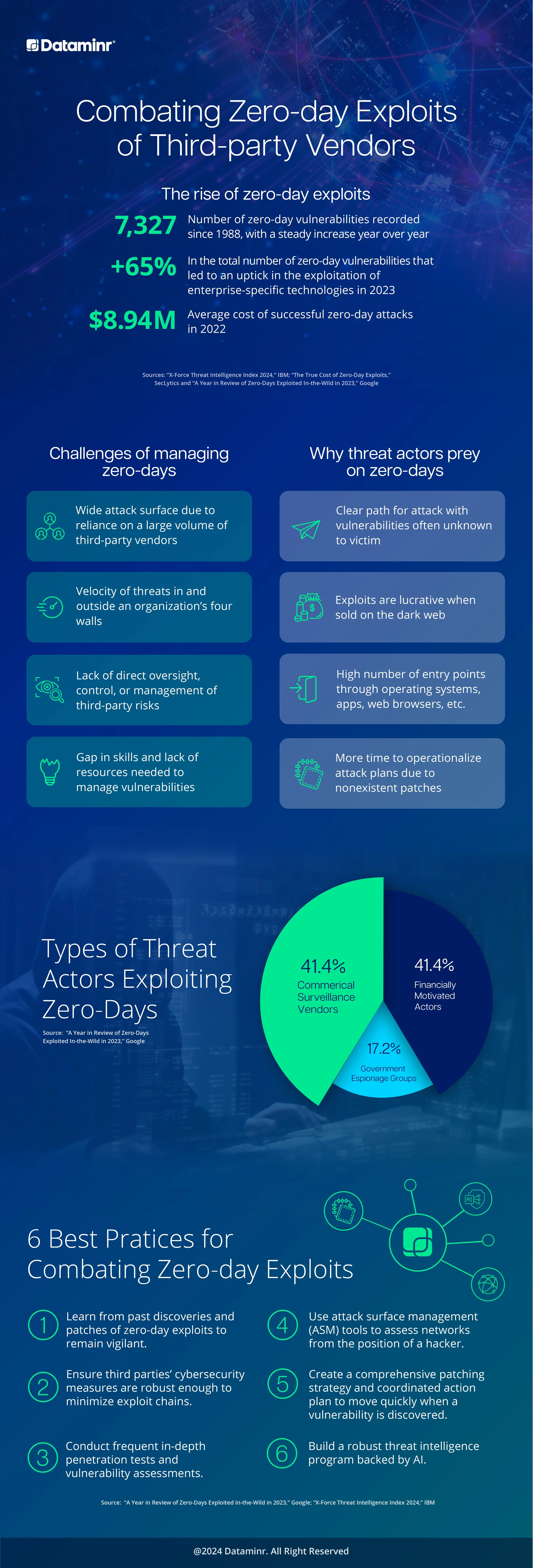
Case Study 2: Combating Zero-Day Exploits of Third-Party Vendors
Challenge
Zero-day exploits are increasing and difficult to manage, especially as organizations rely on a growing number of third-party vendors. These vulnerabilities are unknown, unpatched, and costly—making them attractive targets for threat actors.
Approach
I designed an infographic that clearly explains the scale of zero-day threats, why attackers target them, and the challenges organizations face due to expanded attack surfaces and limited third-party oversight. The content is structured to move from data and risk drivers to threat actors and practical mitigation strategies.
Outcome / Key Insights
7,327 zero-day vulnerabilities recorded since 1988, with steady growth year over year.
65% increase in zero-day vulnerabilities impacting enterprise technologies in 2023.
Average cost of a successful zero-day attack reached $8.94M.
The visualization identifies key threat actors exploiting zero-days and outlines six best practices organizations can use to reduce risk.
The final piece translates a complex, technical threat into a clear, actionable visual narrative for security and executive audiences.