Dataminr Brand Evolution
Role: Lead Brand Designer & Art Director
Years: 2019 – 2025
Over six years, I led Dataminr’s brand evolution—from a fragmented visual identity to a cohesive, future-forward system that reflects innovation, clarity, and humanity.

2019–2020: Building the Foundation
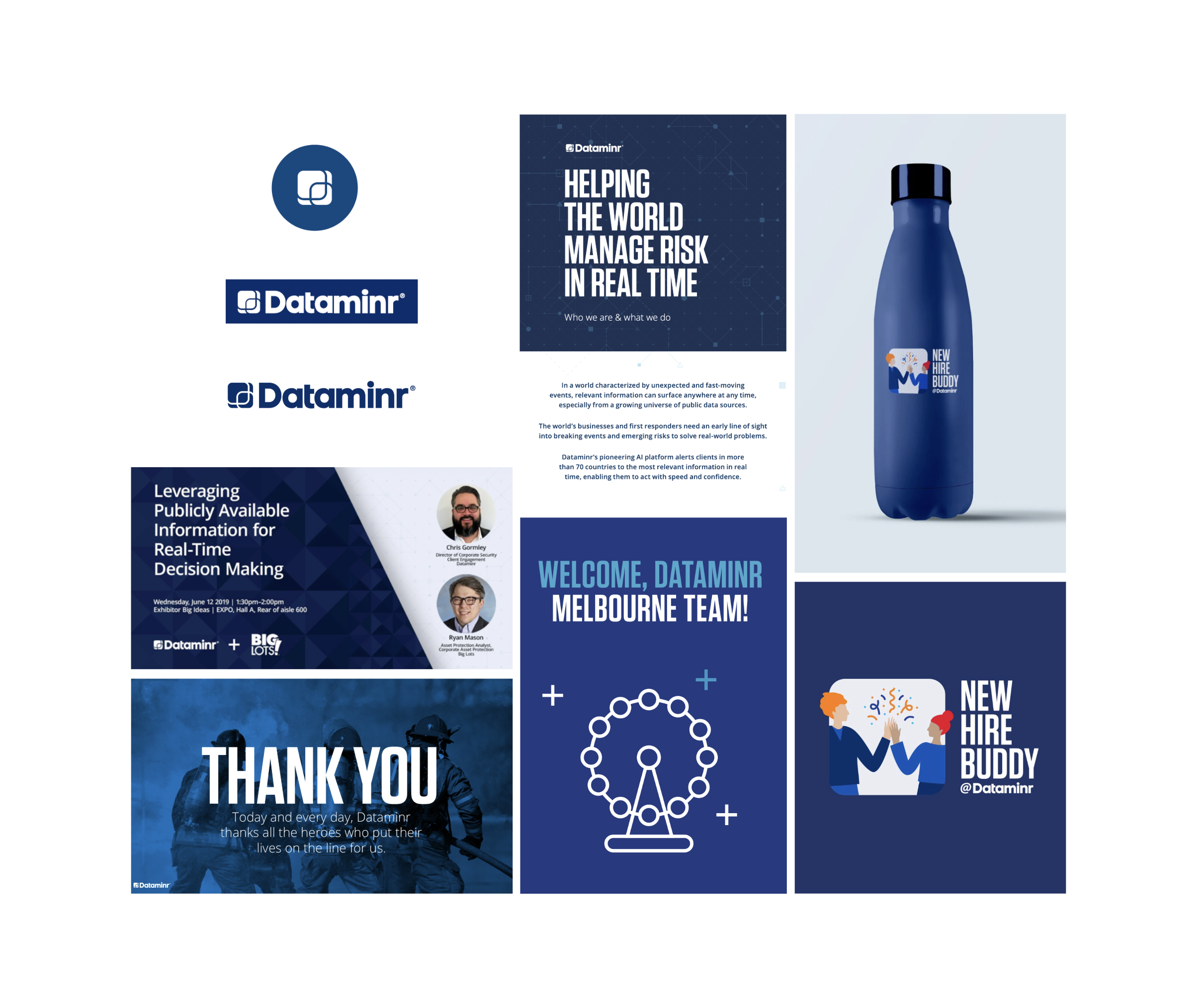
When I joined, Dataminr had just shifted from a multicolor logo to a single navy mark, but consistency was lacking.
Focused on brand consistency and implementation across all digital and internal assets.
Removed outdated globe imagery and legacy patterns.
Replaced and standardized logo usage
across all touchpoints.Established the foundation for a unified and disciplined visual identity.
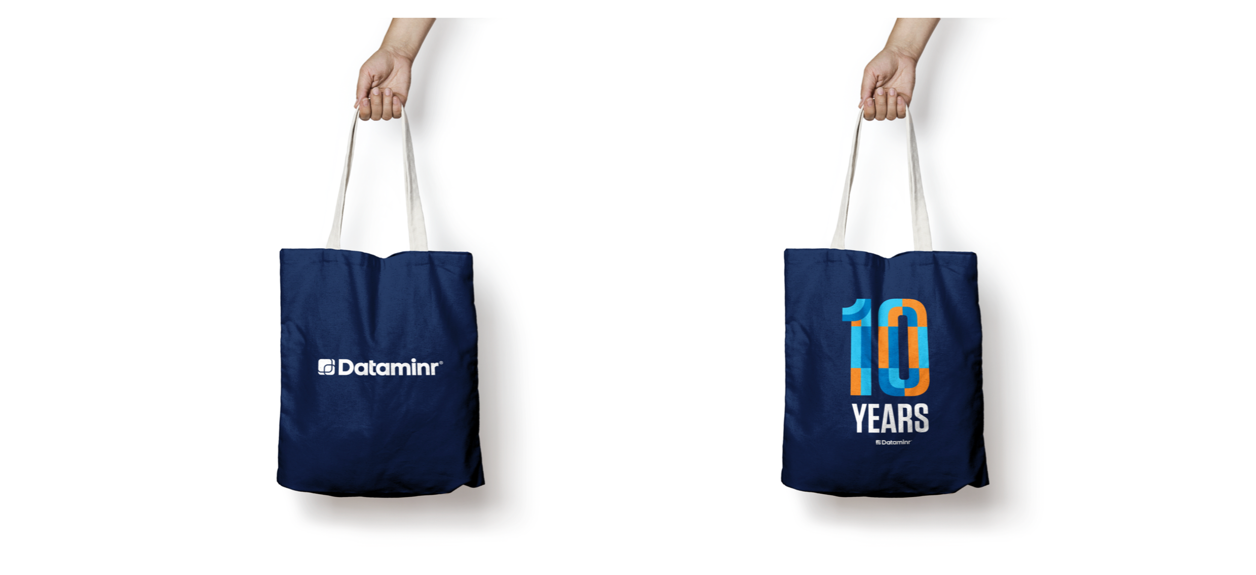
2021–2023: Modernizing the System
With Art Director Peter, we evolved the brand toward a cleaner, more dynamic, and approachable look.
Introduced structured grids and increased white space for clarity and sophistication.
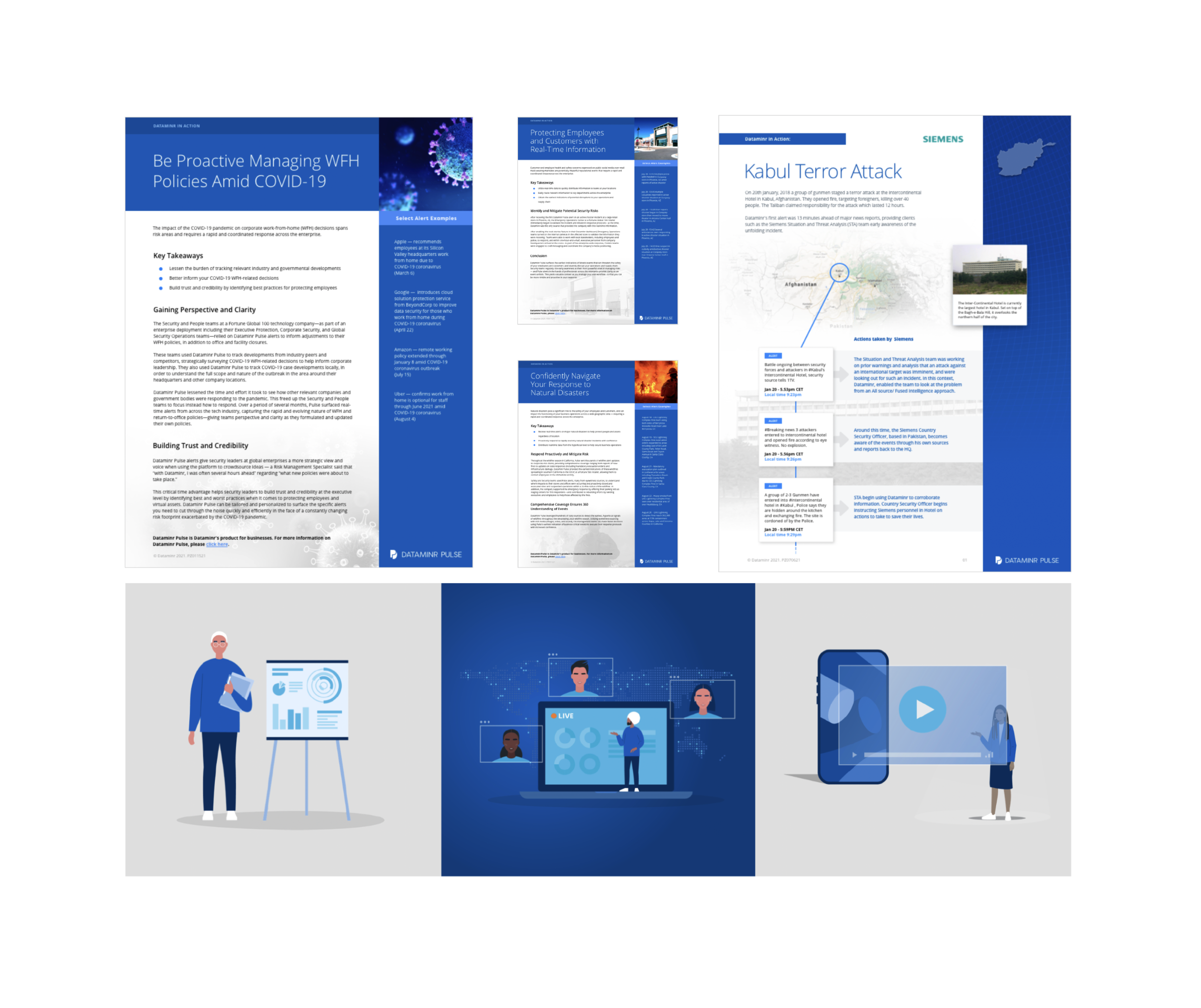
Developed a custom illustration style for infographics and editorial content.
Refreshed marketing and event materials to feel more dynamic and approachable.
Shifted the brand language toward clarity, warmth, and future-forward energy.


2024: Humanizing and Showing the Product
As Dataminr’s AI capabilities expanded, we focused on making the brand feel more human, innovative, and transparent.
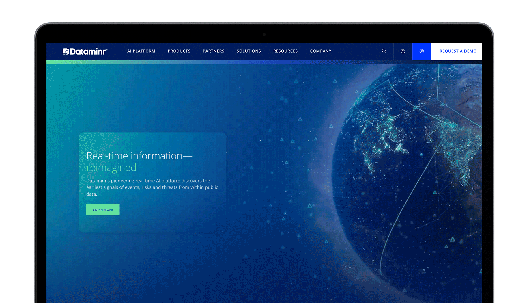
Refreshed the system with a brighter, digital-first color palette and motion-led design.
Designed an animated website hero to bring energy and narrative to the homepage.
Showcased real product visuals and interfaces across the website and marketing touchpoints to emphasize transparency and usability.
Redesigned social templates for a clearer, more relatable presence.
Transitioned to a white logo on dark backgrounds to better express innovation and digital depth.

2025: Agency-Executed Brand Refresh
The brand refresh, executed under agency collaboration and creative direction from Mike Nuzzo, built upon the foundations we developed in previous years, bringing the system to its latest evolution.
The 2025 refresh refined the visual system with a dark, moody aesthetic and luminous highlights, emphasizing the theme: “Bringing clarity through the noise.”
Color palette, lighting, and motion were updated to enhance depth and focus, inspired by the foundations I had developed in earlier phases.
The logo and icon were refined for recognition and digital performance, while retaining continuity with the brand evolution I had led.
This phase reflects a collaborative execution, building on six years of strategic and visual groundwork.

